After receiving her BFA in painting from the Pratt Institute in 1985, Carrie Moyer became somewhat disenchanted with her chosen medium. She supported herself as a graphic designer, and her art practice, in turn, became increasingly design-oriented: She put her talents to use creating agitprop for such groups as act up, Queer Nation, and Dyke Action Machine! (which she cofounded with Sue Schaffner in 1991). All the while, she studied the historical nexuses of art, politics, and design, from Constructivism to the visual production of the ’60s counterculture. Only in the early 1990s did she begin painting again.
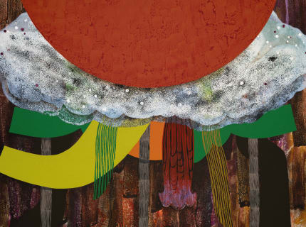
Moyer’s biomorphic abstractions, with their flat, sharply defined shapes and liberal use of areas of bright, uninflected color, show the stamp of her graphic-design background. Yet they also suggest a commitment to painting so single-minded that it’s difficult to believe she ever strayed from it. In her recent exhibition of eleven mostly large canvases at Canada, she seemed bent on exploiting every conceivable effect that can be wrested from acrylic paint, with impressive results. In almost all of the works, ribbons of black pigment swoop across the canvas like freshly laid asphalt. Swelling into podlike protuberances, as for example in Puddy Tat’s Lunch (all works 2011), or branching into irregular fretworks, as in Into the Woods, these elements anchor highly complex compositions built up from disorienting strata of translucent and solid planes. Layers of thinned-down paint meet and overlap, creating sectors of aleatory hues. Fields of texture—splatters, leopardlike spots the artist makes with her fingertips, tiny venous marks created with a paper towel—add to the welter of visual information, as do thin filaments of graphite or acrylic that arc and weave among the layered forms. Moyer frequently makes illusionist mischief, bringing flatness and dimensionality into illogical convergence—as in The Tiger’s Wife, in which an elongated pink shape registers as a transparent flat plane on one end while, on the other, the artist has used shading to model two fleshy callipygian lobes. Yet somehow the eye never gets snarled in the intricacies of these paintings; it keeps moving, beguiled rather than confounded by the Moebius-like slippages.
These are risky works. They evoke Color Field painting and the short-lived school known as “Abstract Illusionism”—perhaps the only mini-movement of the past forty years that has yet to be recuperated—and they court that dreaded quality, prettiness. But a combination of technical mastery and an ineffable, abiding strangeness allows Moyer to successfully walk thin aesthetic lines. While something about Stroboscopic Painting #1 evokes 1970s record-cover art, the work transcends its own flirtation with kitsch via its interplay of sanguine maroon-black darkness and chemical-fire incandescence, its plastic-gel layering of hues, and the powerful, nearly audible force with which its central, phallic form thrusts itself across the canvas.
There’s a bit of glitter worked into the surface of this painting—glitter being a substance Moyer has turned to often in the past, not only because of its optical effects (its glints, she observes, are brighter than white) but because of its connotations. The first time she used it, she told Phong Bui in a recent interview in the Brooklyn Rail, she was directly referencing the disco diva Sylvester. This comment sheds light on a pertinent question: What happened to the political content of her earlier graphic work? In another interview, this one with Christopher Joy and Zachary Keeting, Moyer says she wants her paintings to be “pleasure machines.” Like disco, and like the queer artist-activists who emerged in the ’80s and ’90s, Moyer’s paintings assert that pleasure is political.
...
Read review at artforum.com