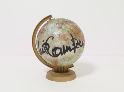
“When I read between the lines the paper stares back at me telling that I haven’t wondered enough,” reads the final iteration of Luis Camnitzer’s Between the Lines (2013), for which this group exhibition at Alexander Gray Associates is named. The work consists of spare, revised versions of the same sentence written on 10 lined sheets of paper. The tone oscillates from deadpan humor to politically charged, collectively dissecting and inquiring into the status quo within systems of power, from the art market to education. Incisive yet playful, Camnitzer's use of language explores words not as a fixed cerebral operation but as an infinitely malleable one—which comes to life in the encounter with the viewer.
Art making too is infinitely malleable, as evidenced by the objects on view: sculptures and works on paper by Camnitzer, Jack Whitten, Valeska Soares, Jennie C. Jones, and Hassan Sharif. Although the artists each cultivate highly personal, distinctive practices, they choose to challenge prevailing modes of art making through serial and conceptual approaches that often highlight the unspoken, the unseen, the unheard of—and that rely on the spectator. Camnitzer has been in the vanguard since the 1960s when he began his exploration of language as a medium to underscore issues of power and commodification. Whitten, in his turn, selected toner in order to investigate shapes, gesture, and improvisation, plane and space in his 1974 “Xerox Project” monoprints. This dry, highly sensitive carbon pigment, meticulously placed on rice paper, imparts an array of effects, from light striped lines to bold black sweeps. Whitten’s first encounter with toner as a medium took place during a residency at the Xerox Corporation headquarters in Rochester, NY in 1974, an experience that proved to be formative in the years to come.
Throughout the 1970s, Whitten experimented with materials, process, and techniques. He began to avoid gestural mark-making, favoring instead mechanical automation. His trial-and-error, process-driven approach to seriality is seen (and felt) through the monoprints’ multiple renditions, which move between premeditated, personal gesture and mechanical automation, drawing and painting. Made following his move to seriality, Xeroxed! (1975) includes multiple toner monotypes organized in a grid and presented on canvas. Its surface alludes to satellite images of the moon—a nod to the artist’s time spent as an airman-in-training at Tuskegee Institute, in Alabama, in 1958. These two historic pieces laid the foundations for Whitten’s later series, including his “Greek Alphabet Series” (1974–79) paintings, which break free from conventional notions of depth and plane in two-dimensional compositions to create texture and space.
Equally innovative in her interrogation of unconventional materials and in her elaboration of “topographical” images, Valeska Soares repurposes a series of Brazilian wooden marquetry boxes, once used as cigar boxes, sewing kits, and keepsake holders, among other mundane objects, in Palimpsest (I) (2016). The boxes depict idyllic Brazilian landscapes, like beaches, the lush vegetation of coconut trees and araucarias, and hills. Soares is in dialogue with the phenomenological experimentation of Neo-Concretism, which is activated by the viewer, and the post-1960s Minimalist installation and assemblage lineages throughout the Americas and Europe. She presents the boxes at eye level in a pleasing panoramic view, semantically charged with memory, nostalgia, absence, and ephemerality. The “drawings” come together at key points: a mountain in one case connects to the lake in another, a river flows into the sea in another one, creating a single vista that invokes both the absent makers of the boxes and the objects they may have once held. Like everything in this exhibition, these enthralling little landscapes guide the viewer from one narrative to another, unveiling past histories and malleable boundaries.
Rooted in the modernist and Minimalist traditions, Jennie C. Jones’s practice relies on sound to build narrative, while speaking to the malleability of techniques, processes, materials, and readings. On view are two sets of drawings, made in 2016, from her ongoing series Score for Sustained Blackness. They break down the confines of musical notation to create abstract compositions that use lines, shapes, and most important, the color black, vibrating from subtle, muted tones to dense areas. For Jones, “blackness” is at once subject and material reality. Her use of this color alludes to 20th century abstraction—from Kazimir Malevich’s Black Square (1915), often considered the “zero point of painting,” to Mark Rothko’s Black Form Paintings (1964). Yet, more than a hue, black becomes charged with sociopolitical meaning, a commentary on the erasure of African Americans from the modernist abstraction and the avant-garde in general by the white establishment. Jones’s work is also rooted in expanded ideas of music initiated by Fluxus artists—one that engages viewers in a reimagining of this language in a myriad of ways, from the visual to performative. It seems that for Jones, “music isn’t just what you hear … but everything that happens,” as explained by Fluxus artist George Brecht.
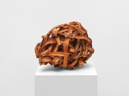
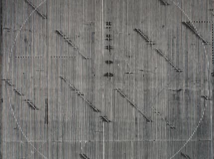
Similarly influenced by the Fluxus movement in confluence with his lived experience, Hassan Sharif, a pioneer of Conceptual art in the Middle East, devised his “Semi-System” approach in the early 1980s in response to a time of social and economic upheaval—the frantic expansion in the United Arab Emirates following the discovery of oil. Based on arbitrary calculations and repetitive permutations, this new aesthetic language conveys a sense of hybrid identity that allowed the making of series of linear drawings including “Semi-Systems” like Seven Points Angular Lines – Part 2 (2013), sequences of marks and slashes that oftentimes resemble a bygone, forgotten alphabet. Other times it appears to refer to an algorithm.
Incredibly distinct and powerfully evocative, the works on view are a universe in themselves—and a mirror to those who look at them. They are, at once, a meditation on artmaking and its ever-evolving approaches, and a metalinguistic exercise for their creators and to the viewer alike. It all comes down to Camnitzer’s final line: “When I read between the lines the paper stares back at me telling that I haven’t wondered enough.” It reminds me of Jorge Luis Borges’s “The Aleph,” a short story in which the Aleph is a point in space that contains all other points, a metaphor for the recurring theme of infinity within Borges’s oeuvre. Anyone who gazes into it can see everything in the universe from every angle simultaneously. Like “The Aleph,” everything here converges and reflects, overflowing with signs and meaning, and expanding the sphere of the thinkable and the sayable.
...
Read full review at brooklynrail.org.